This is the second part explaining the journey of my first startup. To read the first part, click here.
By 2020, JoinGroupChat.com had evolved from a dormant idea to a tool that was actively helping communities during the pandemic. But I knew it could be more. The potential was clear—it just needed the right push. 🚀 That push came when I enrolled in the Entrepreneurship Minor at the University of Amsterdam. If you’ve ever wondered what it’s like to take a side project and attempt to turn it into a full-fledged startup, keep reading…
Diving into the Entrepreneurship Minor
Joining the Entrepreneurship Minor felt like stepping into a whole new world. Suddenly, I wasn’t just a lone tinkerer—I was part of a team 🤝. I teamed up with three others: Livius, Luka, and Toine. With guidance from experienced mentors like Bas Lemmens, co-founder of Booking.com, and Antonio Duarte, founder of Yapbreak, we were ready to take ShareableURL.com to the next level.
Our first challenge was to truly understand our users. We spent countless hours interviewing current and potential users, asking them questions like 💬, “What problem were you trying to solve with ShareableURL.com?” and “Which features would you pay for?” The feedback was eye-opening 👀. We discovered that while users liked the idea, they found the customization options confusing and wanted a more intuitive user flow. In other words, a better user experience.
Pivotal User Interviews
One of the most insightful moments💡came from an interview with Thomas Stephens, the government worker from Sudbury who had used JoinGroupChat.com to organize mutual aid during the pandemic. He discovered our site through a Google search for “customize WhatsApp invite links” and used it to connect vulnerable people with volunteers. Thomas suggested adding a feature to restrict access 🔒 to links for security reasons, which would be a game-changer for use cases like his. This feedback pushed us to think more broadly about the platform’s potential.
Another critical interview was with Niek. Niek was a fellow student of the entrepreneurship minor and he formed a startup called Wogo. The Wogo team used wix.com to make their website but they hadn’t paid to upgrade their wix account so their website link was fitnesscampboots.wixsite.com/wogo. Niek and his team thought that this looked unprofessional so they used ShareableURL.com to turn that link into signupURL.com/wogo. Niek and his team posted it on social media including Instagram and linkedIn. The following image is the Instagram bio of one of the Wogo team members:
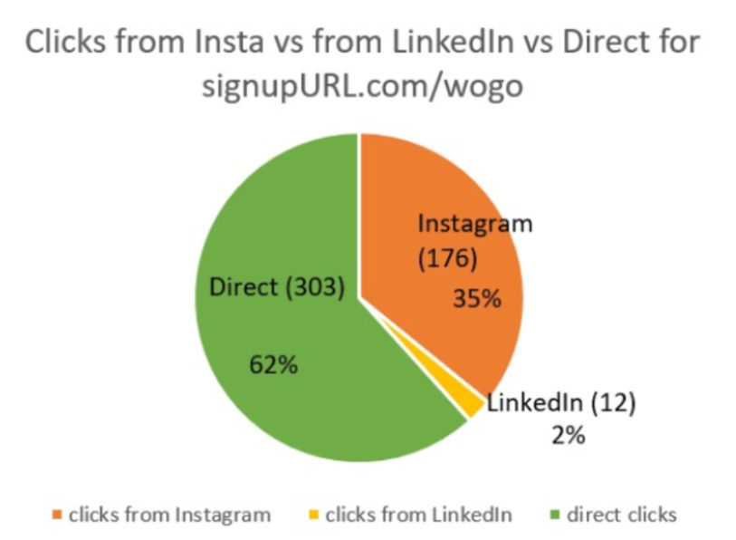
During our conversation with Niek, he highlighted the importance of analytics on where clicks were coming from, in order to see the effectiveness of his social media campagin.
Sidenote: Wogo is still up and running and has become a successful company.
These conversations reinforced that ShareableURL.com had real potential but also highlighted areas for improvement 🔧. We needed to make the platform more user-friendly, offer enhanced security features like password-based restrictions, and provide detailed analytics 📊 that users could rely on.
Experimenting with mandatory user registration 🔬🧪
Armed with user feedback, we began experimenting with different ways to enhance ShareableURL.com. One of our early experiments involved making account creation mandatory before users could shorten links. The idea was to to introduce users to more features, such as a user dashboard and link management tools.
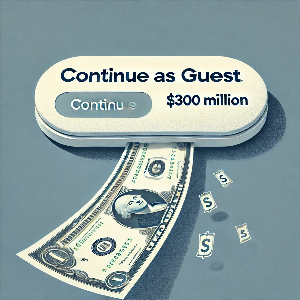
The results were clear. The number of links created dropped dramatically 📉. It became clear that requiring an account was a barrier for many users, who preferred the ease of anonymous use. After seeing the negative impact on user engagement, we quickly went back to allowing anonymous link creation, recognizing that convenience was key for our users. Eliminating user friction can have a huge impact. For example, Amazon once had a checkout process that required users to register before making a purchase. This mandatory step frustrated many potential customers 😠, leading to high abandonment rates. In 2001, Amazon hired Jared Spool, a UX expert, to improve checkout rates. By simply adding a “Continue as Guest” option, Jared eliminated the registration barrier and Amazon saw an immediate $300 million increase in annual sales 💰.
The First Paying Customer 🎉: A Milestone and a Lesson
One of the most significant milestones came on September 29, 2020, when we received our first payment from a user named Rachel. She paid $1 USD for a monthly premium membership on ShareableURL.com. It was a small amount, but it was huge validation that people were willing to pay for our service ✅.
Unfortunately, Rachel canceled her account shortly after, citing confusion about how the site worked. We refunded her money and sent a follow-up email to understand what went wrong. Her feedback was crucial: she found the process for link customization unclear and frustrating. This highlighted a key area where we needed to improve—making the user experience as smooth and intuitive as possible.
Making the homepage more user friendly 😊
Armed with valuable user feedback, we set out to streamline the homepage, making it more intuitive and user-friendly. Here’s how it looked before:
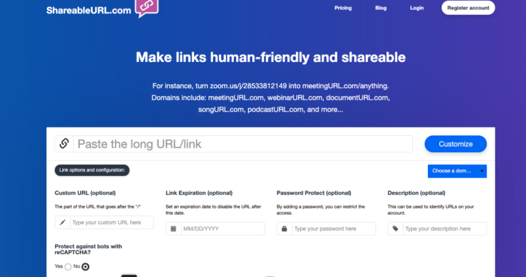
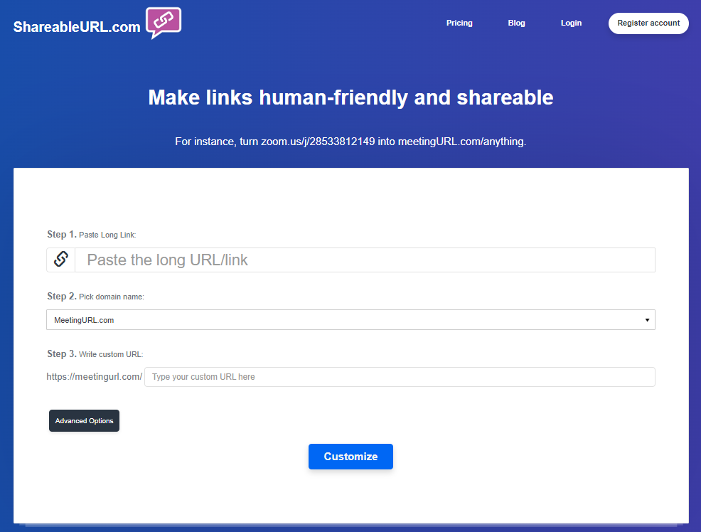
We condensed the homepage subtitle into a clear, single sentence and outlined the process in three simple, sequential steps ✅. To avoid overwhelming users, we also tucked the advanced options behind a toggle button, revealing them only when needed. This is how the homepage looked after implementing these changes:
Marketing and outreach 📣
We used a guerilla marketing strategy, wherein we directly reached out to influencers on platforms like Instagram, offering them customized links for their content. One of the more notable users was Nathan Piland, a well-known artist and internet personality.
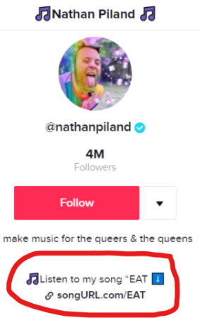
While his customized song links didn’t drive as much traffic as we’d hoped, it was exciting to see our tool being used by someone with a large following. This experiment showed us the potential for wider adoption, even if the initial results were modest. After talking with Nathan, we realized that social media users often wanted to share multiple links—like links to their website, latest content, or online store. However, they were restricted by the social media platform’s limitation, which only allows them to include one clickable link in their profile bio. This made it difficult for them to share all the important links they wanted their followers to see 👀. This insight is what led us to set up Linkpage.bio.
Pivoting to Linkpage.bio
As we gathered more data and insights, it became clear that ShareableURL.com had a specific use case, but there was an opportunity to expand beyond just URL shortening. The feedback from users like Nathan and Niek made us realize there was a demand for more comprehensive link management tools, particularly for social media.
This realization led us to pivot and create Linkpage.bio based off of a template I found online. Linkpage.bio is a platform that allows users to create a custom landing page to showcase all their important links in one place. It’s particularly useful for social media platforms like Instagram, TikTok, and Twitter, where users are restricted to a single bio link 🔗. With Linkpage.bio, users can overcome these limitations and manage multiple links effectively.
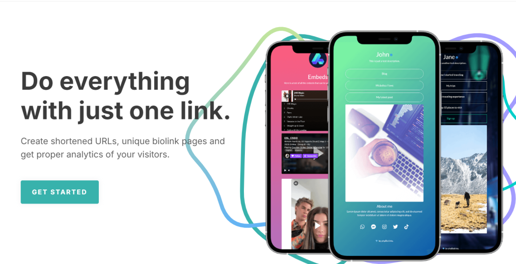
Despite this pivot, we decided to keep ShareableURL.com as a standalone website. It continues to serve those who need a simple, reliable URL shortener with additional features like password protection and link management. This dual approach allows us to cater to both casual users who need quick link shortening and more engaged users who want a comprehensive link management solution.
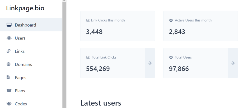
By the time I publish this, linkpage.bio has had almost 100k users, of which 2,843 have been active in the last month, a small portion of which pay for a premium account.
Lessons Learned and Looking Ahead🔭
As we concluded the Entrepreneurship Minor, it was clear that ShareableURL.com and Linkpage.bio had significant potential, but there was still much work ahead. While the other team members moved on to pursue exciting new projects, I have continued to maintain the websites over the years. However, my focus has also shifted to other ventures, including my current role as a product designer at Interfas.ai, and running UserExperience.org.
Looking back, the journey from a simple hobby project to a startup was anything but straightforward. It involved a lot of trial and error 🔄, some unexpected successes 🎉, and a fair share of challenges. But through it all, if there’s one thing I’ve learned, it’s that staying flexible, listening to feedback👂, and being willing to pivot are essential to turning a side project into something truly meaningful.
Thanks for reading <3, I hope you enjoyed it. I’d love to hear what you think down in the comment section below ⬇️.

Leave a Reply