Ever found yourself too lazy to cook after a long day? What if your kitchen could turn into a music, light, and energy filled experience every time you prepare a meal? 🎶💡
As part of the Interaction Technology Innovation course at Utrecht University, my team – Marija Anbinderytė, Elena Tzara, Alexis Ganciu, Ko Schoemaker, and I – explored this idea by creating the “Slice of Magic,” an enchanted cutting board designed to make cooking more engaging and enjoyable. 🍽️✨
🔧Our Process:
We started by exploring themes around wellbeing, habits, and nutrition. With the course challenge to “enchant” an everyday object, we focused on the cutting board. Using iterative design, we built a prototype fitted with lights and speakers controlled by a Raspberry Pi, aiming to see how these elements could transform a routine task into an engaging experience. After gathering feedback and refining our design, we conducted usability tests to assess the impact.
Changes based on feedback
❌ Removed touchscreen: users were reluctant to touch it with dirty fingers.
❌ Removed phone holder: users already have other means of keeping the phone standing.
➕Added volume button 🔊.
➕Minimalistic buttons with small surface area to maximize cooking area.
❌Removed color wheel: users prefer it to change automatically.
🎵 Sound effects were changed to looping beats instead of full songs and instruments.
How It Works:
🔪When you chop ingredients, the cutting board detects the pressure and plays musical instruments.
The volume and light intensity change based on how hard you press.
Different areas of the cutting board trigger different instruments and colors.
By pressing the genre button, users can choose between three different music genres, each with its own unique set of instruments.
🔍 What We Learned:
– 80% of users reported that the Slice of Magic made cooking more fun.
– 72% of users felt a sense of enchantment while using it.
These results suggest that integrating interactive elements like sound and light can significantly enhance the cooking experience, turning a routine task into something more creative and enjoyable.
You can watch our final presentation here:
Continue reading for an in-depth behind the scenes account of our journey, I hope you enjoy it 🙂
INTRODUCTION & TEAM BUILDING (WEEK 1)
A brief introduction of myself for context: I’m doing the AI master’s program at Utrecht University, after having worked for KLM as user experience designer. I
went back to university to learn more about AI and the interaction of humans and technology. I chose to do the Interaction Technology Innovation course specifically because focus on design thinking and working on projects. I was surprised when I found out we were going to build physical prototypes, since my passion till then had been software. However, I came to like building a physical product because we could explore more of human computer interaction in the real world.
I chose the role of designer, as I wanted to continue working on my skill of transforming abstract ideas into concrete designs. I met a group of others and, given our compatible roles, we decided to form a team. However, as time went on, the roles became more flexible and I also worked on user research, administration, communication with other teams and teachers, programming, and working on the hardware.
This year’s theme was enchanted everyday objects, and we ended up making the “Slice of Magic”™ Cutting Board.
My goal in creating this diary is not only to document our process but also to critically analyze our experiences to gain deeper insights into the field of interaction technology. Through this reflection, I aim to inspire others. I hope you find this reflection both insightful and enjoyable to read.
CONCEPT MAP /DESIGN SYNTHESIS (WEEK 2)
In the second week of the course, we got together to start brainstorming ideas. We settled upon wellbeing and started making a concept map, which facilitates communicating about the relation between ideas by making mental models more concrete (source). We struggled to make a concept map using a whiteboard. We kept coming up with new ideas, which meant a lot of rearranging, and made it confusing to follow. We decided to use Miro, a digital digital collaborative whiteboard platform. This almost instantly made the process much more flexible, since instead of having one person at the board trying to note down and organise everyone’s ideas, we could all work on it and place concepts where necessary. From this, I learned about the versatility of digital technologies in the facilitation of creative collaborative tasks like brainstorming (source).
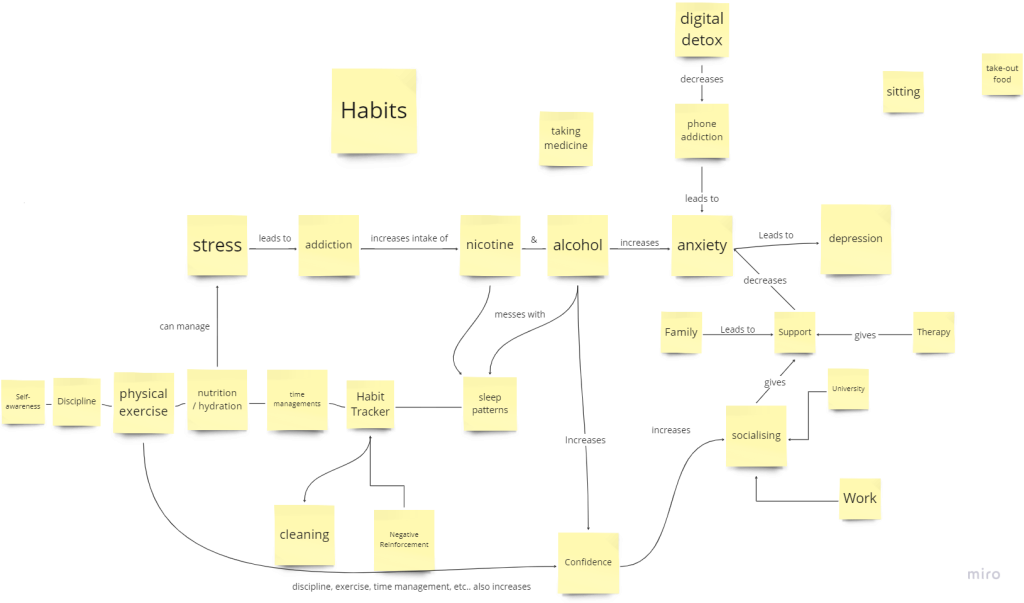
We realized that our interest within
wellbeing was on wellbeing habits, so we made a new concept map focused on that:
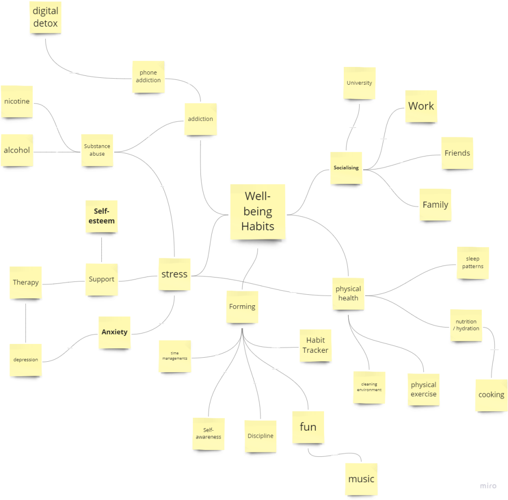
What’s interesting to note is that the theme of cooking is already present in the 2nd concept map, showing that the process ultimately leads to the solution. We used the insight combination technique to come up with design ideas, developed by Jon Kolko. We started out by brainstorming insights, which are characterizations of behaviour, e.g. people work better together when they know each other. I tend to come up with ideas quite quickly, so this was where I was able to put my brainstorming abilities to good use. We came up with 37 insights, and grouped them by similarity, and then distilled them until we had 5 insights left. We did the same for design
patterns, which are generalised solutions to a problem, e.g gamification increases engagement, and narrowed them down from 27
to 7. See the figure below for the insights and design patterns:

Then, we combined insights with design patterns, and came up with potential product ideas. See the design ideas figure:
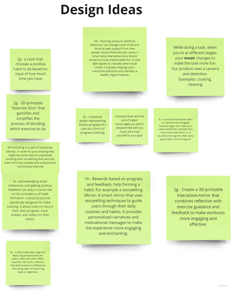
We ended up choosing the combination of insight 4: “Habit formation is strongly influenced by environmental cues and triggers” and pattern B: “Multi-sensory elements (sound effects or haptic feedback) enhance the overall sensory experience of habit engagement” to form the following design idea: “While doing a task, when you’re at different stages, your music changes to
make the task more fun.” Examples: cooking, cleaning”. This concept strongly appealed to me. I became deeply interest in habit formation and behavioral change after having read the book ’Atomic Habits.’ The author suggests that making tasks rewarding and fun helps build habits, a principle that our design concept realizes by making everyday activities more enjoyable.
Initially, before we even started with the design process, we wanted to build an enchanted water bottle. This still emerged as a potential product after the design synthesis step. However, we found out that a similar product already exists (hidrate spark). Another contender was an enchanted mirror, although we heard rumours that another group was working on this, and this product
also already exists (polarheat.nl)
PERSONAS / SCENARIOS / STORYBOARDS / CUSTOMER JOURNEY MAPS (WEEK 2)
We defined personas, and their corresponding scenarios, storyboards, and customer journey maps. We weren’t sure how to come up with the persona’s and how many to have. Ultimately, we made persona’s based on the different goals they might have. We came up with three personas based on the following goals:
- Anna (Sound engineer): Wants to make cooking with friends funner.
- Oscar (Student): Wants to stay motivated to cook meals.
- Santiago (Chef): Wants enhanced creativity to come up with new recipes.
I came up with Oscar, and based him on my own experience with cooking. This made it easier, since I know myself better. From
this, I learned the importance of being able to imagine yourself in the shoes of the users.
Based on initial feedback, we added the following elements to the design: - Change surface colour based on what type of food is being prepared to make it more enchanting and to prevent crosscontamination.
- Use lights and sounds to increase enchantment: when placing an object on the cutting board, a ripple wavelike effect
appears, providing immersive visual interactions. - Sounds correspond to the cuisine being prepared. E.g. Chopping vegetables for a stir-fry, the cutting board plays Chinese
instrumental sounds.
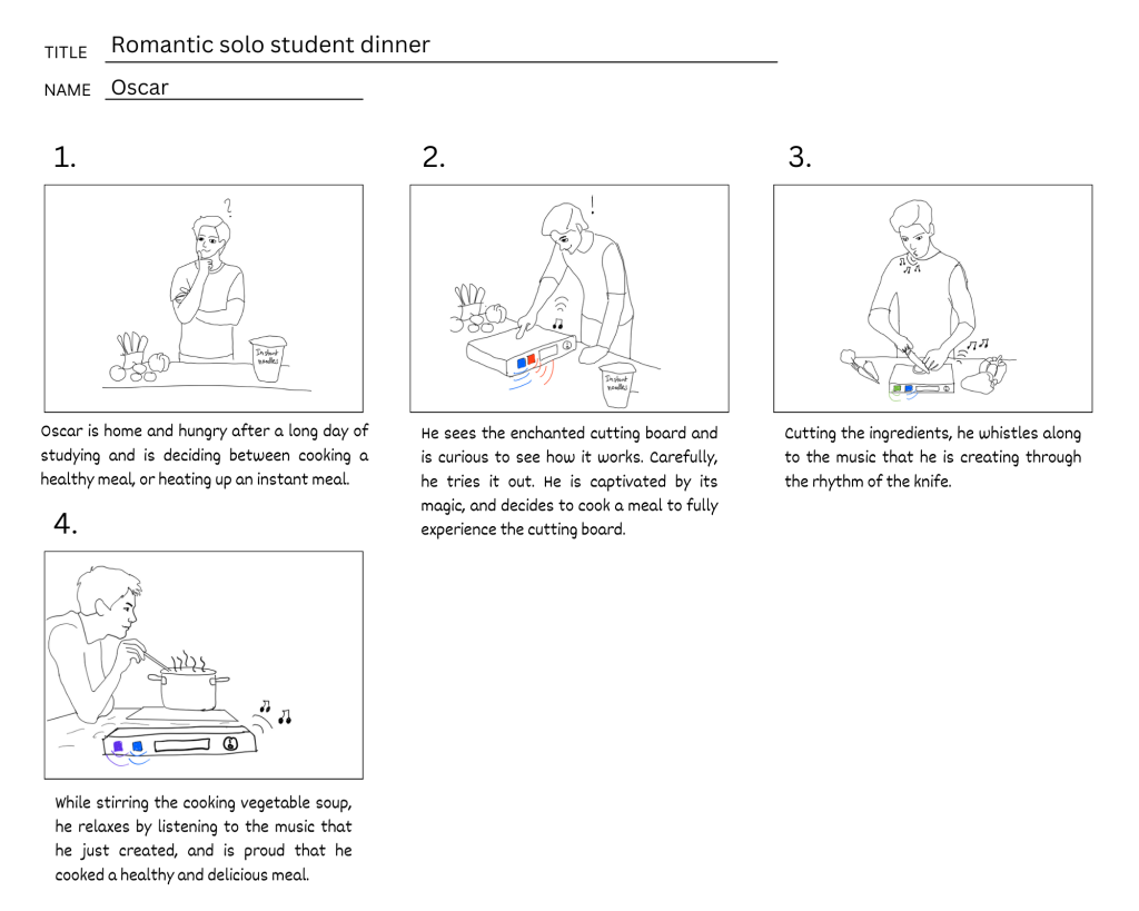
I made the storyboard for Oscar. I used DALLE-3 to generate images, and then I drew over them, adjusting for my preferences. AI is a widely used tool to overcome creative block, and boost creativity (source). Following story boarding best practices, I kept only the essentials to avoid adding unnecessary details to clearly portray what was important. It became clear that the way that the board sonifies the experience is essential. We decided to do it based on the cutting rhythm.
WORK ON LOW FI PROTOTYPING (WEEK 3-6)
After coming up with a range of features, it was time to turn these ideas into reality in order to answer the research question:
“”How can enchantment be used to transform the mundane task of cooking into an enjoyable, creative, and engaging experience?”.
Our first point of interest was the size of the board. While I preferred a large cutting board, the other team members and most
feedback participants preferred a smaller cutting board. This is one of the benefits of using low fi prototypes, since the designs can
quickly be adjusted (source).
User interviews
On February 26th we started gathering feedback on the prototype. I decided to use the semi-structured interview method, since this allows you to be more open to new directions based on how the interview flows (source). Wilson (2014) suggests trying not to bias interviewees by giving them too much information. I did this by asking what their first thoughts were when looking at the prototype. This helped us understand how they perceived it, and unlocked their imagination, which we used to add new feature ideas. For instance, we asked “What do you imagine the sonification would be like when interacting with our prototype?”, to which someone replied, “it would sound like the Fruit Ninjas app”, which emits a steel blade swishing sound every time you cut a fruit. In order to test the placement of buttons, we used the technique of paper prototyping, a method recommended by Snyder (2003). This involved crafting paper buttons and asking participants to share their thoughts on different layouts, and to organise them in a manner they found intuitive. This approach highlighted the affordability and simplicity of obtaining feedback, effectively addressing the common concerns about high costs and time investments that often discourage companies from conducting usability studies, as discussed by Nielsen (1994).
Testing assumptions
I learned the importance of asking follow up questions to critically test assumptions. For example, one of the participants suggested she would prefer having the buttons on the side to have more space for cutting. However, when asked how she stores her cutting board, she realized that because she stores it by laying it on its side, it would be inconvenient to have buttons on the side. This is something that could be explored further, for instance by making a protective case for the buttons. Another assumption was that everyone cooks and uses a cutting board, at least occasionally. However, midway through an interview we realised that the subject never uses a cutting board! He uses other surfaces like plates to cut, but mostly does not prepare meals that require cutting ingredients.
Feedback on enchantment
During the lecture on the 7th of March, I realised that we had not looked deeply into what enchantment actually is. After doing some research, I found enchantment to be defined as “an arousal state encompassing a potent sense of connection or oneness with a transcendent power” (source). I suggested that we conduct further interviews in order to measure perceived enchantment, including follow up interviews with previous participants, but the others disagreed, saying that we were low on time. We compromised by splitting the work up, with Ko and Marie focusing on other tasks, and Elena, Alex, and I conducting the remaining interviews. I came up with the idea to show a list of adjectives associated with enchantment, and ask users to highlight which ones resonated with them when they imagined using the cutting board (source). The choice of this research method was appropriate and important for me since it helped to explicitly test our assumptions on how enchanted it was. For instance, someone responded feeling inspired due to the lights, which aligns with the research question that our prototype was made to answer. Furthermore, I asked which elements make it feel less enchanted, and it turns out that having buttons on the board reminds users of machines and technology, which makes it less enchanted. However, we decided to keep the buttons on top since having them on the side made them harder to reach, and inconvenient to store on its side, and therefore less user friendly. The following is a summary of the changes made based on feedback:
- Removed touchscreen: users were reluctant to touch it with dirty fingers.
- Removed phone holder: users already have other means of keeping the phone standing.
- Buttons on the front instead of on the side.
- Added volume button.
- Minimalistic buttons with small surface area to maximize cooking area.
Changes related to enchantment:
- Removed color wheel: users prefer it to change automatically.
- Sound effects were changed to looping beats instead of full songs and instruments.
- Mesmerizing light patterns and diverse music genres.
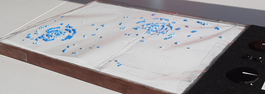
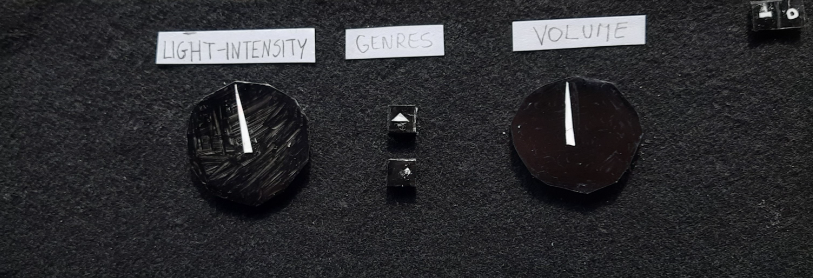
Most of the changes we made on feedback did not surprise me, except for the removal of the color wheel. I had expected users to prefer having more control to be able to customize the experience, but it seems that having the colors change automatically adds to the enchantment. The final design of the lo-fi protoype is shown below:
Feedback from teachers
Throughout the process, we received feedback and guidance from the teachers, especially regarding the direction of the project. For example, I suggested we use a large tablet sized touchscreen, protected by a transparent surface. The TA explained that this would put the focus on software instead of hardware, and since this course is primarily focused on hardware, we dropped the idea.
HIGH FI PROTOTYPE
After having received feedback on our low fi prototype, it was time to build the high fi prototype in order to address our research question in a more realistic way. On the 4th of March, we discussed how we would actually implement it. We discussed three options:
- Pressure sensors
- Knife with conductive surface on cutting board
- Toggle buttons
We spent considerable time comparing the options. In line with the Rapid Iterative Test and Evaluation method, described by Medlock (2005), I suggested that the best way to find out what works is to just go to the protolab and get hands-on experience with different components. By doing this, we realised that using pressure sensors was the best option. We had several meetings with Lennart about which components to order. I took the lead in this, by explaining the required functionality, and taking notes. One of the major decisions was which development platform to use (Raspberry Pi vs Arduino). In line with ideas from Clarke (2000), I suggested choosing the Raspberry Pi for its larger community support for audio mixing. We divided up the work based on components. Ko and I focused on the hardware and the rest focused on laser cutting the frame. However, we soon realised how interdependent the two tasks were. The configuration of the components determined the dimensions of the wooden frame. By that time, they were already modelling and starting to laser cut the frame, and were under
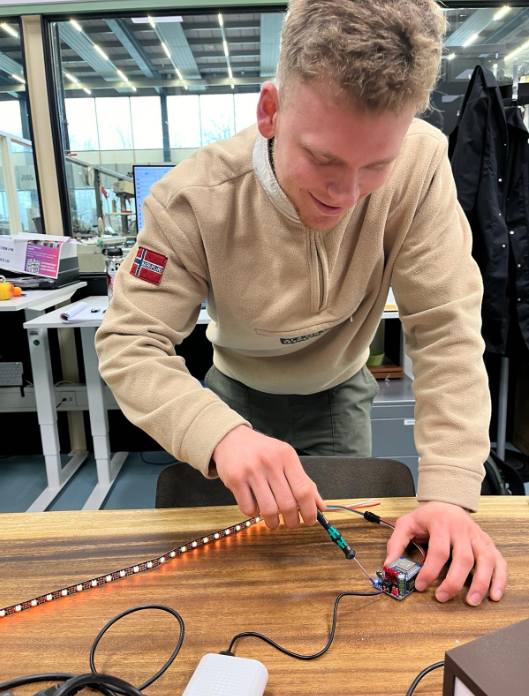
time pressure since another group needed the laser cutter. This led to high pressure on us to quickly come up with new dimensions. In order to prevent groupthink and bad decisions, which often occurs more often under time pressure (Wilcox, 2009), I suggested we go back to the drawing board and take our time. On March 21st, I managed to connect the led lights to the raspberry Pi, which I was very proud of.
After that, I focused on the speakers. Following ideas from the Agile Manifesto, in which collaboration is essential (Beedle, 2001), I reached out to Anastasis from the doormat group that was also working on speakers. We exchanged useful focused on thats. On Thursday 28th of March, after many hours of trial and error, and with the additional help of Julie, I got the speakers to work! I was really excited, and began writing code to get it to change the volume based on pressure sensor data. Using ChatGPT, I
got it to work within minutes, which shows the power of AI.
Design changes between lo-fi prototype and hi-fi prototype
As the deadline approached, we faced the challenge of completing our high-fidelity prototype on time. To speed up progress, we decided to simplify the design. Originally, our interface included two buttons for navigating the music genre selection—one to advance forward in the list and another to move backwards. Given that we had previously decided to reduce the music genres
from three to two, I proposed eliminating one of these navigation buttons. Not only did it make it easier to build, but this also helped simplify the user experience. Furthermore, we removed the power button, since the Rasberry Pi lacks a built-in capability to be powered on via a button press, so the user would have to plug the chord out and back in to restart it. Lastly, I decided to
simply the design of the lights, by removing the ripple effect and instead making the lights change color based on which pressure sensor is triggered.
Overall, the changes that we made are not an issue since the point of the hi-fi prototype is to able to answer the research question, which it is able to answer, since it contains elements that could be considered enchanted, and it can be used to cut ingredients.
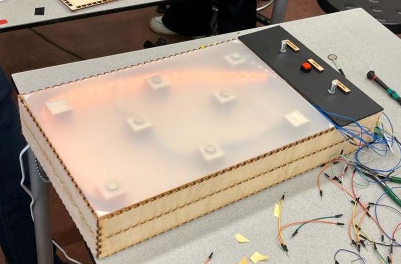
User Interviews
After completing the hi-fi prototype, a teammate and I started conducting user research to answer our research question. My teammate gave a
brief explanation of the functionalities, and then asked participants to cut some carrots with it. Meanwhile, I wrote down how they behaved, and what they said or asked. I suggested to my teammate that we ask them to narrate what they were thinking out-loud to make it easier to figure out what they were thinking. However, my teammate said that this might affect their behavior by making them more self-conscious, and thus bias our data. This made sense to me, and since she was in charge of user research we decided to do it her way. However, if I were to conduct more interviews, I would ask them to narrate their thoughts out loud, in line with what Jakob
Nielsen said “Thinking aloud may be the single most valuable usability engineering method” (source).
Reflection on research question
The research question was: “How can enchantment be used to transform the mundane task of cooking into an enjoyable, creative, and engaging experience?”. Users found the board intriguing. At first, even after receiving an explanation, they struggled to fully understand how it worked. This piqued their curiosity. Some users found the music and sounds fun, captivating, and even motivating to cook. For example, one user started moving along with the music. This made me feel happy, since our hard work paid off. However, some users found the music and lights annoying and distracting. These tended to be people that already enjoy cooking, and therefore found no purpose in adding whistle and bells to the experience. This was a new insight for me, as I expected people proficient in cooking to want to find new ways to make the experience more engaging. It seems that trying out new recipes and cooking styles is enough to keep them passionate and engaged.
Final reflection
“You can’t connect the dots looking forward; you can only connect them looking backwards” (Jobs, 2005). This quote captures the essence of what I’ve learned from this course and from making this reflective diary: the value of embracing the creative journey, allowing ideas to form and evolve naturally, rather than forcing a specific outcome. Overall, I am pleased with the progress we made as a team and with how much I learned. I’d like to thank the other students, teachers, and the staff in the protolab for this. There were times when I was not sure whether or not we would make it, and that I questioned whether we would build something novel and “enchanted” enough. However, looking back, each step of the journey took us closer to the end result.

Leave a Reply